Online
Sanford Wurmfeld
Immersed in Color Transitions: Transforming Spaces and Visual Perceptions
October 17 - December 19, 2025
This presentation surveys paintings by Sanford Wurmfeld that span five decades of his long, creative career in art. While researching several specific series and particular paintings for institutions and collectors, which required working closely with Wurmfeld and his archives through 2025, it became apparent that an important and critical presentation had been created.
Amassing individual artworks from Wurmfeld’s historic series, many quite large in size and of great importance regarding the development of his painting practice, as well as canvases from his most recently completed series of nearly 25 paintings, the Corona Variations, the artist’s career-long aesthetic evolution is manifest in his myriad empirical processes and compositional changes throughout the decades.
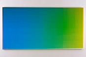
The objective of this presentation is to map the aesthetic elements, and process shifts in Wurmfeld’s compositions. His work at first used grids of equal size elements, then gradually shifts to grids of varying size elements and finally to overlapping out of phase grids of differing sizes to create the subtle, gradual gradients of hues and values transitioning from one color to the next. These aesthetic and process changes along the way culminated in one of Wurmfeld’s most crowning achievements, the heroic-scaled, elliptical-shaped, immersive Cyclorama paintings that measure 8.5 foot x 30.5 foot x 26.5 foot. The paintings are installed in a two-story structure that the viewer enters on the first floor and walks upstairs emerging into a visual and emotional experience like no other.
Wurmfeld focuses on color and its impact in a space and on the visual perception and psyche of the viewer. Aside from the complexities and nuances within each series and painting, the emphasis in this presentation is to reduce his process to two key visual points. First, the fragmentation into small bits of color is the core element and key starting point; then visual assimilation into parts the whole of the color spectrum being considered. Like a good jazz musician, the entire composition is best comprehended in parts before the whole. Hence, the logic for “breaking it down” as the first step.
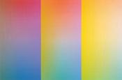
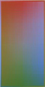
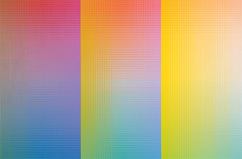
If a single color is the focus of the composition, then the scale of the interior overlapping grids determines the subtlety of the value transitions across the canvas or whether a border is added, if any, to one side or around the perimeter. Borders greatly effect the whole and can be subtle or dynamic in altering color perceptions. The larger the swath of the spectrum being contemplated with 2 or more colors included, then the more compositions can be divided proportionally. Over the decades, Wurmfeld has split the compositions in half, vertically or horizontally, into thirds, or even grids of 3-over-3 equal squares within a larger 9 square grid, as in the 1974 compositions, or even more divisions in the larger horizontal, full spectrum paintings. Often there are no obvious breakdowns per se and the various spectral colors meld and transition from one to the other with each hue creating the internal compositional divisions as seen in II-15#1B (R-G/=V) (Vertical).
Regardless of the number of compositional breakdowns and interior segments, each contains complex overlapping grids of colors that relate to each other according to the artist’s color strategy. Different values and proportions of color in each segment creates its own transition between the hues and values, yet each relates to the overall composition to manifest harmony and rhythm across the entire painting. Keeping with the jazz music analogy, a composer wants melodies and refrains, or fragments thereof, repeating throughout to create a rhythm and continuity within the composition. This is also vital for Wurmfeld’s paintings as the number of colors increases and the works get larger and more complex. This is where the fragmentation into interior grids varying in scale allowed him to perfect his process resulting in sophisticated compositions that seem to flow effortless across the canvas, while the painstaking, minuscule and numerous complex details can go undetected.
The second core visual element of this presentation is the selected degrees of saturation or desaturation of the colors within and between each composition. This is very noticeable and has an impact on the entire composition by directing the viewer’s eye. Saturated colors can be more vivid, bolder, and brighter while desaturated colors can make the color transitions and compositions more subtle, quieter and calmer. The degree of color saturation affects the emphasis and mood of the painting along with the ambient lighting. Therefore, the space or environment where paintings are installed can be impacted by the difference in the degree of color saturation as well as the range of values of the hues. Several paintings from the 1970s, 1990 and 2003 are examples of saturated colors that are vivid and high key. The vertical painting from 2001 and those from 2023, the Corona Variations series, are examples of the colors being desaturated and neutralized, thus creating subtle variations and transitions between the colors.
The large-scale installations of the Cyclorama paintings were inspired by Wurmfeld’s fascination with panorama paintings from the 18th and 19th centuries along with his passion for color, color adjacencies and interactions, optical color mixing in the viewer’s eye, and the immersive and all-encompassing aspects of color. The historic panoramas were often of landscapes and cityscapes that provided viewers with a novel 360 view of their environment with sightlines and perspectival views they could observe themselves. Such panoramic views were in stark contrast to the more conventional “birds eye view” created and presented at that time. Wurmfeld adapted panoramas to suit his needs of giving viewers a sensational and perceptual experience of being surrounded by prismatic color without distraction or interruption.
Eschewing any need to reference scholars to critically validate and place Wurmfeld’s work in art history, renowned art historian and author, Robert L. Herbert stated in 2009 after viewing and experiencing Wurmfeld’s E-Cyclorama, “I anticipated pleasure, but I had no idea of the exaltation that awaited me.” […] He continued, “To look at Wurmfeld’s paintings and his ‘Cycloramas’ is to think of the ways his craftsmanship celebrates rationality while also provoking curious sensations that can’t be readily defined. We enter a world of geometric order and prismatic harmony that involves feelings compatible with magic. I can’t think of a better definition of creativity.” [1]
John Gage likens Wurmfeld’s painting approach to that of Seurat’s painting process using dots and the optical mixing of the adjacent colors. He notes the “lustre” achieved by Seurat, attributing it to a “flicker or glimmer” off the surface that is perceived by viewers as “brilliant” and “translucent”. Gage notes a similar luminosity and transparent surface with Wurmfeld’s paintings and Cylcoramas vis-à-vis his use of small adjacent squares of color to achieve optical mixing and the harmonic transition between colors. Gage also makes another observation comparing Wurmfeld’s Cycloramas, historic panoramas of landscapes, and the light pieces by James Turrell, in that all confine the viewer to a viewing area to enhance a singular vantage point for a long period of time to allow the viewer time to adjust to the light and confines in order to achieve the true perceptual and psychological experience of each installed artwork.
Notes:
[1] Sanford Wurmfeld: Color Visions1966 – 2013, Curated by William Agee, 2013, Hunter College, The City University of New York, p. 14.
[2] John Gage, Color in Art, 2006 Thames and Hudson, pages 56-57.